The desk is full of objects that are easy to overlook. A pen, ruler or clip is usually understood through function first and design second. KACO reverses that hierarchy just enough to make the familiar visible again. Its products remain recognisable and uncomplicated, but proportion, colour and the meeting of small parts are treated as decisions rather than leftovers.
KACO says it was established in Shanghai in 2011 and focuses on writing instruments and creative stationery. Its official introduction describes a design philosophy built around simplicity, excellence and timelessness. Those words are broad; the more useful evidence is found in the products. The TUBE Aluminum Gel Ink Pen and RUMA Aluminum Ruler + Bookmark show two different ways the philosophy becomes an object.
A brand built at everyday scale
Stationery is an unforgiving design category. The objects are small, inexpensive relative to furniture or electronics and surrounded by established conventions. A click pen needs a point, barrel, clip and push control. A ruler needs a straight measuring edge and legible scale. Change too much and the object becomes awkward; change too little and the design disappears into the category.
KACO’s approach is not to turn these tools into sculptures. It concentrates on alignment, transitions and a controlled family of finishes. The products communicate through the relationship between functional parts. That makes the brand legible without requiring a large logo or ornamental surface.
TUBE: colour held inside one structure
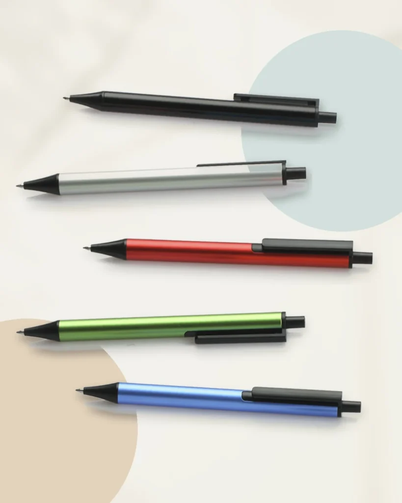
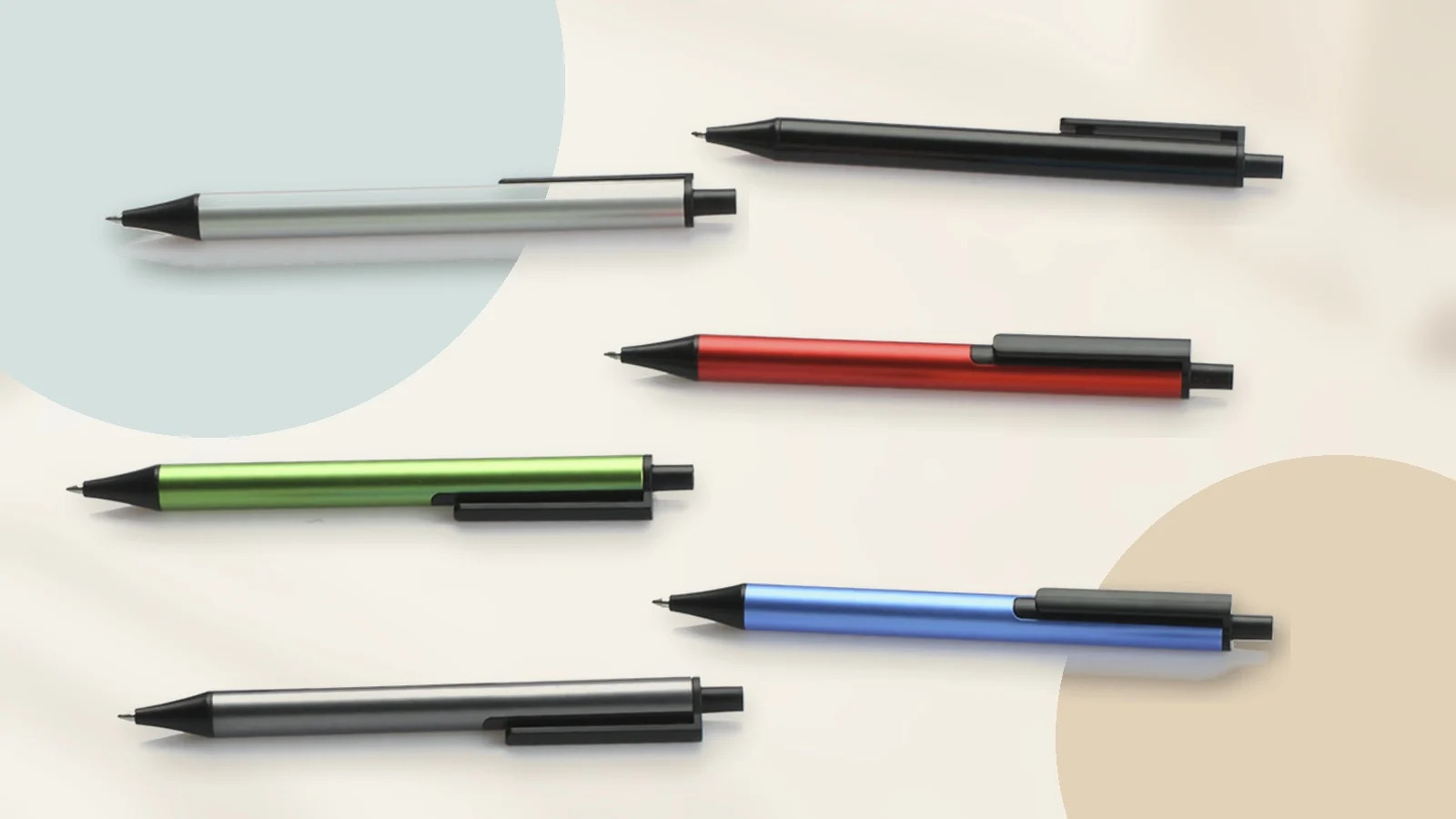
TUBE is a retractable gel ink pen with a slim aluminium barrel. Its black conical nose, side clip and rear push control form a consistent functional layer around the coloured body. The official presentation shows the same construction across black, silver, cyan, red, green, blue, orange and grey, with a separate purple presentation.
The value of the colour range is not simply variety. Because the structure remains stable, the pens read as one system. Colour identifies individual objects without changing how the user understands the clip, point or control. A group can look varied and still feel organised.
KACO’s presentation credits Lin Fan and displays Golden Pin Design Award and 2016 Good Design Award marks. ChinoMuse records these as manufacturer-published information rather than an independent audit of the award archives. The more immediate design observation is visible without an award: every colour has to work with the same black functional components, so the palette is disciplined by the product architecture.
The clip as a line, not an attachment
Pen clips often feel added after the barrel has been designed. On TUBE, the clip runs parallel to the body and extends toward the rear push control. From the side, the clip and control create a second line above the cylinder. The relationship makes the mechanism readable while keeping the silhouette narrow.
This is a small example of KACO’s stated preference for simplicity. Simplicity here does not mean removing the clip or hiding the click mechanism. It means organising necessary parts so they appear to belong to one object.
The official page establishes product identity and aluminium construction. It does not establish writing smoothness, balance, clip tension, refill life or finish durability. Those remain physical-use questions, not conclusions that can be drawn from the image.
RUMA: a second function made by one fold
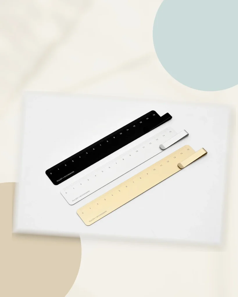
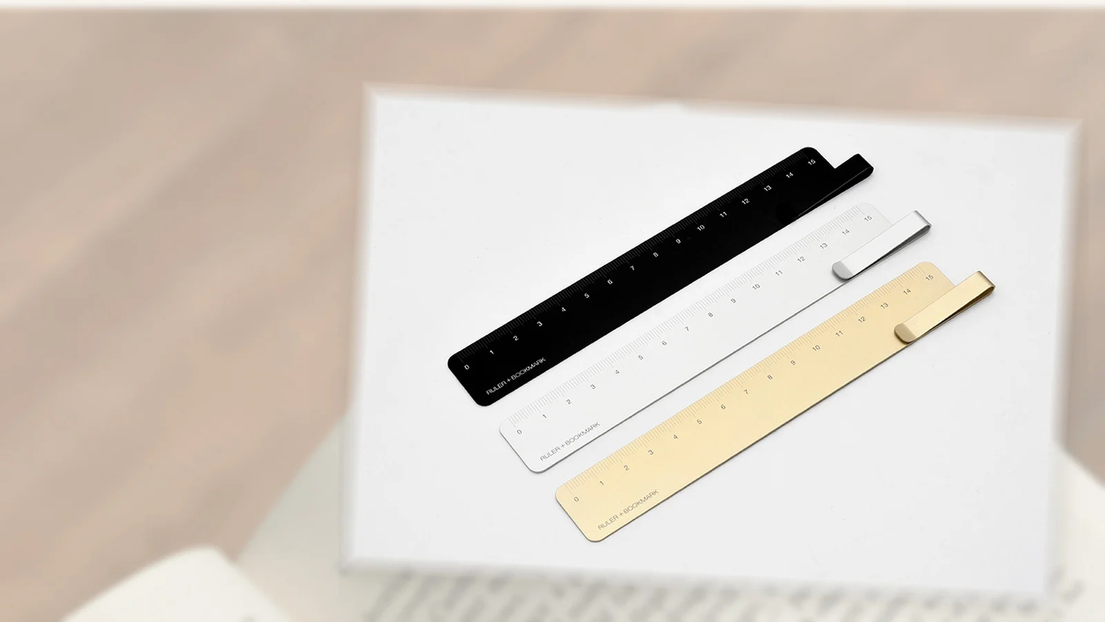
RUMA begins with a 15cm aluminium ruler. One end rises and folds back along the body, creating a bookmark clip without adding a separate spring or component. The measuring surface remains flat while the return creates enough separation to sit over a page.
The object shows a different form of restraint from TUBE. Instead of coordinating several visible parts, RUMA asks one piece of material to perform two jobs. The fold is both the visual identity and the functional change.
KACO’s official presentation shows black, silver and gold versions and credits Lin Fan. The product remains quiet in each finish because colour follows the full length of the aluminium plane. The engraved scale and folded end supply the contrast.
Two ways to create a family
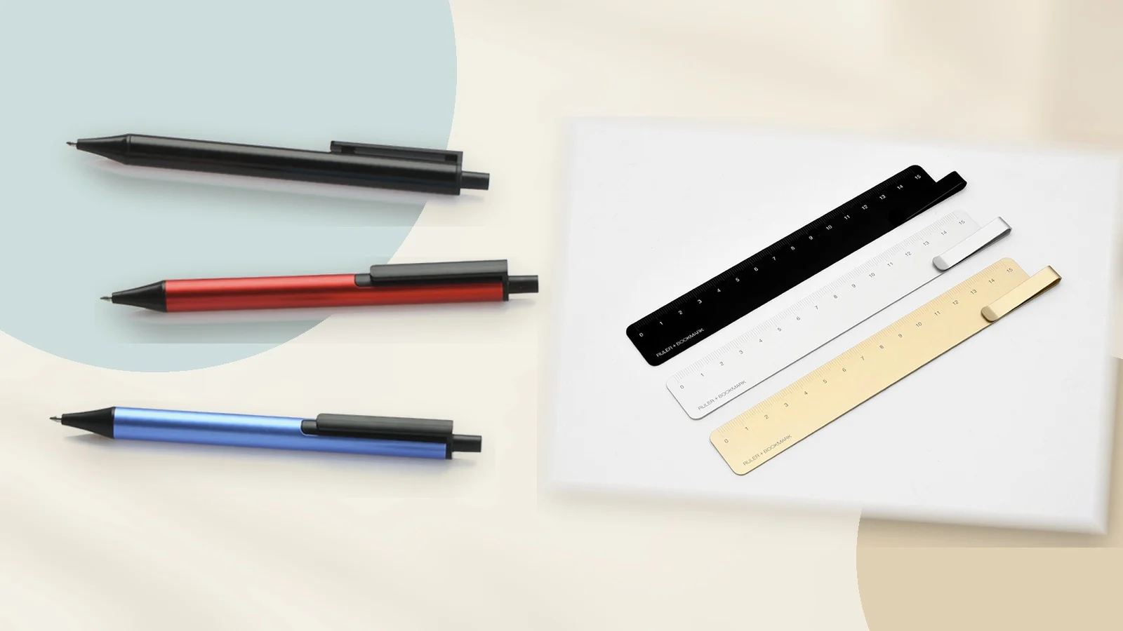
TUBE and RUMA do not need identical silhouettes to belong together. One is cylindrical and assembled from several components; the other is flat and defined by a single bend. Their relationship comes from reduced geometry, metal surfaces and details integrated into the main form.
This is important for a stationery brand with a broad catalogue. A rigid house shape would not suit pens, rulers, storage and office accessories equally. A set of design habits is more flexible: use colour as a system, keep functional parts legible and reduce visual noise around the main interaction.
Design recognition and daily usefulness
KACO’s official introduction lists Red Dot, iF, Good Design, China Red Star Design, China Good Design and Golden Pin among the awards received across its work. Awards can help a stationery object receive attention in a crowded category, but they are not the end of the story. The products still return to ordinary tasks: making a line, measuring a page and staying with a notebook.
The tension between recognition and everyday use is part of KACO’s relevance. The objects are presented as design products, yet their success depends on whether the clip, refill, scale and folded edge continue to make sense after the packaging is gone.
What “timeless” can mean for stationery
KACO uses “timeless” in its published design philosophy. For a small desk object, that idea is less about escaping fashion completely and more about avoiding features that make the object difficult to understand once a trend passes.
TUBE keeps the established grammar of a retractable pen. RUMA remains a ruler with a clear metric scale. Their distinction comes from proportion and construction rather than a new operating language. That makes the objects accessible even when the colour palette or finish preference changes.
Long-term usefulness still depends on practical conditions that the philosophy cannot guarantee: refill availability, engraving durability, clip tension and the continued supply of the chosen version. These need current product information and, where decisive, physical use.
Shanghai origin, international design vocabulary
KACO identifies Shanghai as its place of establishment and describes a global outlook. Its English-language site places writing instruments, daily writing, cultural and creative products and accessories inside one catalogue. The design language—reduced form, anodised colour and integrated components—travels easily because it does not depend on a long textual explanation.
That international legibility does not erase the brand’s origin. It shows one way a contemporary Chinese stationery company can participate in a global industrial-design vocabulary while building a recognisable system of its own.
Reading KACO through the two objects
A brand statement can describe simplicity; TUBE shows it through aligned components and repeated colour. A statement can describe excellence; RUMA turns the claim into a question about the precision of one fold, one engraved scale and one polished edge. A statement can describe timelessness; both objects retain familiar operating logic.
Neither product represents KACO’s entire catalogue. Together they are useful because they show the brand working at two levels: refining the parts of a common object and combining functions without losing clarity.
The result is not stationery that demands attention every time it is used. It is stationery designed so that, when attention does fall on it, the reason for each line, colour and fold can be understood.