
The touchscreen did not remove the need for controls. It changed where controls appear and how long they remain visible. A command on glass can disappear with a menu; a knob, switch or shaped button stays in place. The hand learns where it is.
Across several current Chinese consumer-technology products, physical control has become part of the object’s appeal again. The examples do not prove a market-wide reversal. They reveal a narrower editorial pattern across keyboards, game controllers, compact tools and printers already documented by ChinoMuse—one that cannot be explained by nostalgia alone.
The screen did not make every action clearer
Software is excellent at accommodating many functions inside limited space. Its weakness is that the same surface can mean different things from one moment to the next. A control may sit behind a menu, move after an update or require the user to remember a shortcut.
Physical controls make a smaller promise. They occupy space, so there can be fewer of them. In return, position, shape and resistance can communicate what the object expects from the hand. The useful comparison is not analogue against digital. It is persistent control against conditional control.
A knob gives an action a location
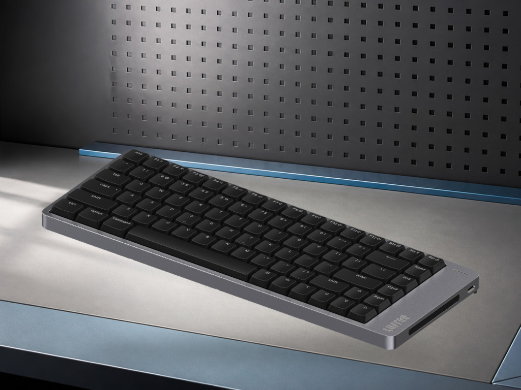
The Lofree Block Mechanical Keyboard places two knobs and a small status display above its 98-key layout. Lofree identifies the knobs with volume control and mode selection, while the panel shows operating information. The keyboard still depends on electronics and wireless modes, but common changes receive fixed places on the body.
A volume shortcut can be efficient once remembered. A knob is legible before memory is involved. Its position shows that adjustment is possible, and rotation suggests the kind of change the user will make. The control also preserves continuity: it remains in the same place whether the keyboard is connected through Bluetooth, 2.4GHz wireless or USB-C.
The benefit should not be exaggerated. ChinoMuse has not assessed knob resistance, switch feel or long-term durability. The point is visible in the architecture: Lofree chooses to spend physical space on two repeated actions.
An independent panel removes shortcut burden
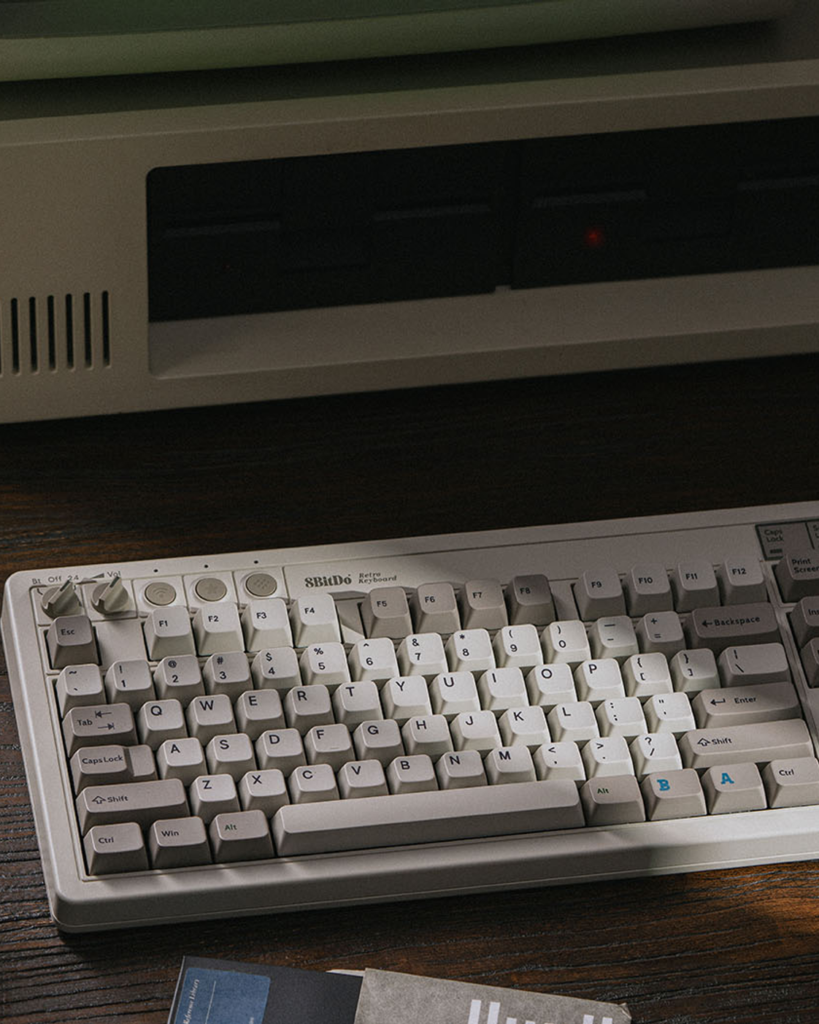
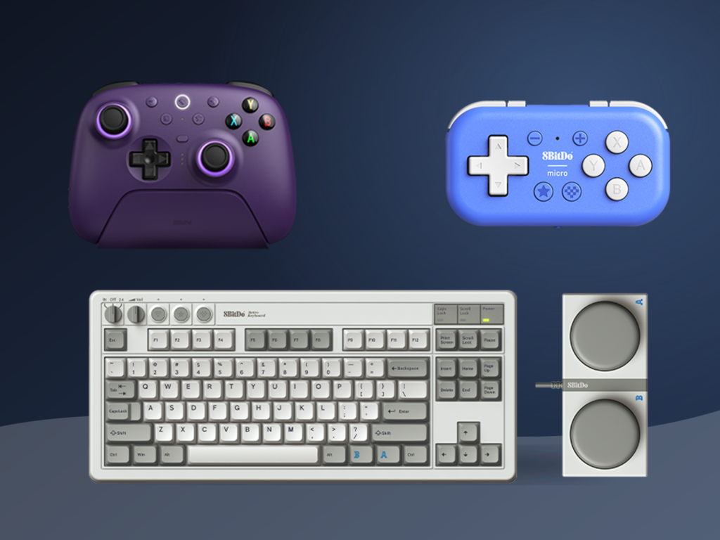
The 8BitDo Retro Mechanical Keyboard M Edition uses an 87-key layout with an independent control panel, a volume knob and three connection modes. It also includes two programmable Super Buttons. 8BitDo’s official presentation explicitly frames the controls as a way to manage functions without relying on complex shortcuts.
The visual references to early home computers are deliberate, but the design is not a reconstruction of old hardware. Wireless connection, key mapping and programmable buttons belong to a current system. The older vocabulary supplies large, separated controls that are easy to distinguish from the main key field.
This is where nostalgia becomes functional. A memory of older equipment can make the product approachable, but the enduring value lies in separation: connection, volume and programmable commands do not have to compete with ordinary typing.
Modularity turns the whole object into an interface
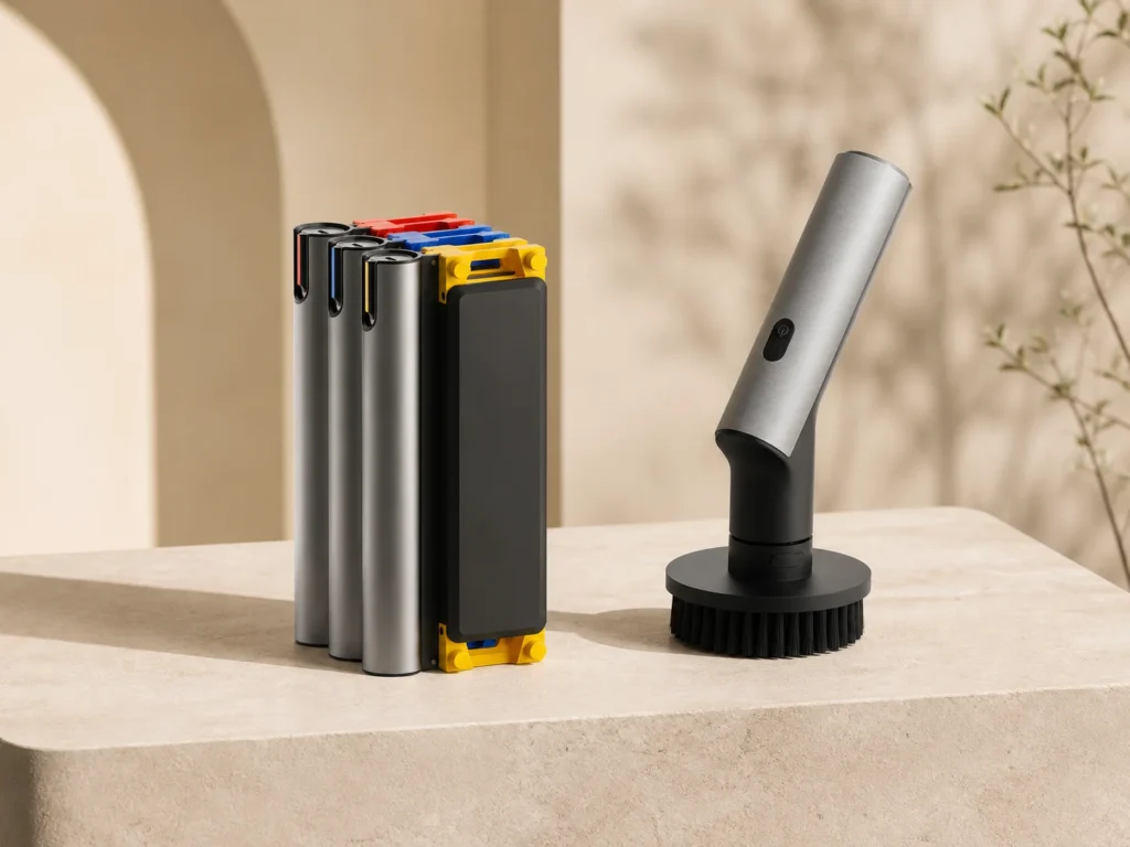
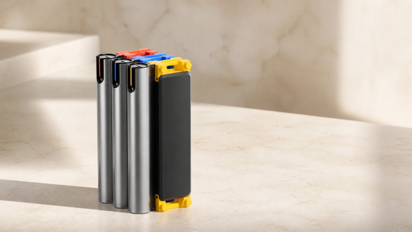
HOTO’s SNAPBLOQ Modular Precision Tool System takes physical legibility beyond a button or knob. The official system groups a precision screwdriver, mini drill and rotary tool as distinct modules. The form and attachment of each module communicate the task before power is applied.
A modular system makes selection part of the interface. The user chooses the physical tool, not a software mode that asks one body to imitate every function. That can reduce ambiguity, but it introduces another dependency: the value of the system depends on exact modules, accessories and compatibility.
SNAPBLOQ therefore shows both sides of visible control. Physical difference can clarify use, while a proprietary architecture can narrow future choice. Modularity is not automatically simpler; it is simpler when the needed module is present and the connection remains supported.
The physical object can still depend on software
The NIIMBOT B21 Pro has a compact body with visible feed and control points, yet label composition largely happens on a phone or computer. The machine demonstrates that physical and software interfaces are not separate worlds. They divide the workflow.
The printer handles media movement and output. Software handles language, templates, barcodes and arrangement. The product remains understandable only when both sides are documented: print width and media sensing on the hardware; current application, operating system and region on the software side.
This division also explains why a physical button is not enough. A clear control can start a task, but the system around it must still expose model, state and compatibility.
Retro is only one route to legibility
Lofree and 8BitDo use recognisable references to older office and computer equipment. HOTO uses a more contemporary modular language. NIIMBOT reduces the object and moves composition to software. The common thread is not a shared style. It is the effort to make frequent actions discoverable.
Retro styling attracts attention because it recalls a period when switches and dials were prominent. That does not make every retro control useful. A decorative switch that duplicates an easier command can add theatre without clarity. The test is whether the control gives an important action a stable location, distinct shape or reversible movement.
Reversibility matters
Physical controls often make change easier to reverse. A knob can be turned back. A mode selector shows that another position exists. A detachable module can be removed and replaced. The action leaves a spatial trace.
Software can provide equally good reversibility, but only when state is visible and the path back is clear. Poorly designed menus hide both. This is why direct controls remain valuable for volume, connection, tool selection and other actions that users repeat while concentrating on a larger task.
There is a cost to every control
Buttons take space. Moving parts can wear. Labels can be ambiguous. More controls can make a product intimidating, especially when secondary functions are printed around every surface. Physical does not mean intuitive by default.
The strongest examples use hierarchy. The main typing field remains dominant on the keyboards. The independent panel is separated from it. SNAPBLOQ gives different tasks different modules rather than crowding one handle with unexplained modes. B21 Pro keeps device controls limited because layout work belongs elsewhere.
Good physical control is selective. It asks which actions deserve permanence.
What this says about contemporary Chinese design
These products come from brands working in different categories and serving international markets. They do not represent all Chinese consumer technology. Together, they show designers using physical control to distinguish objects in categories increasingly shaped by software.
The result is not a rejection of the screen. It is a negotiation with it. Software keeps breadth and updateability; the object keeps the actions that benefit from position, shape and touch. The most convincing products make that boundary easy to understand.
This story is based on current first-party product pages and documentation checked on 10 August 2026. ChinoMuse has not physically tested the controls, switches, modules, applications or long-term durability discussed here. Product specifications and software support may change.