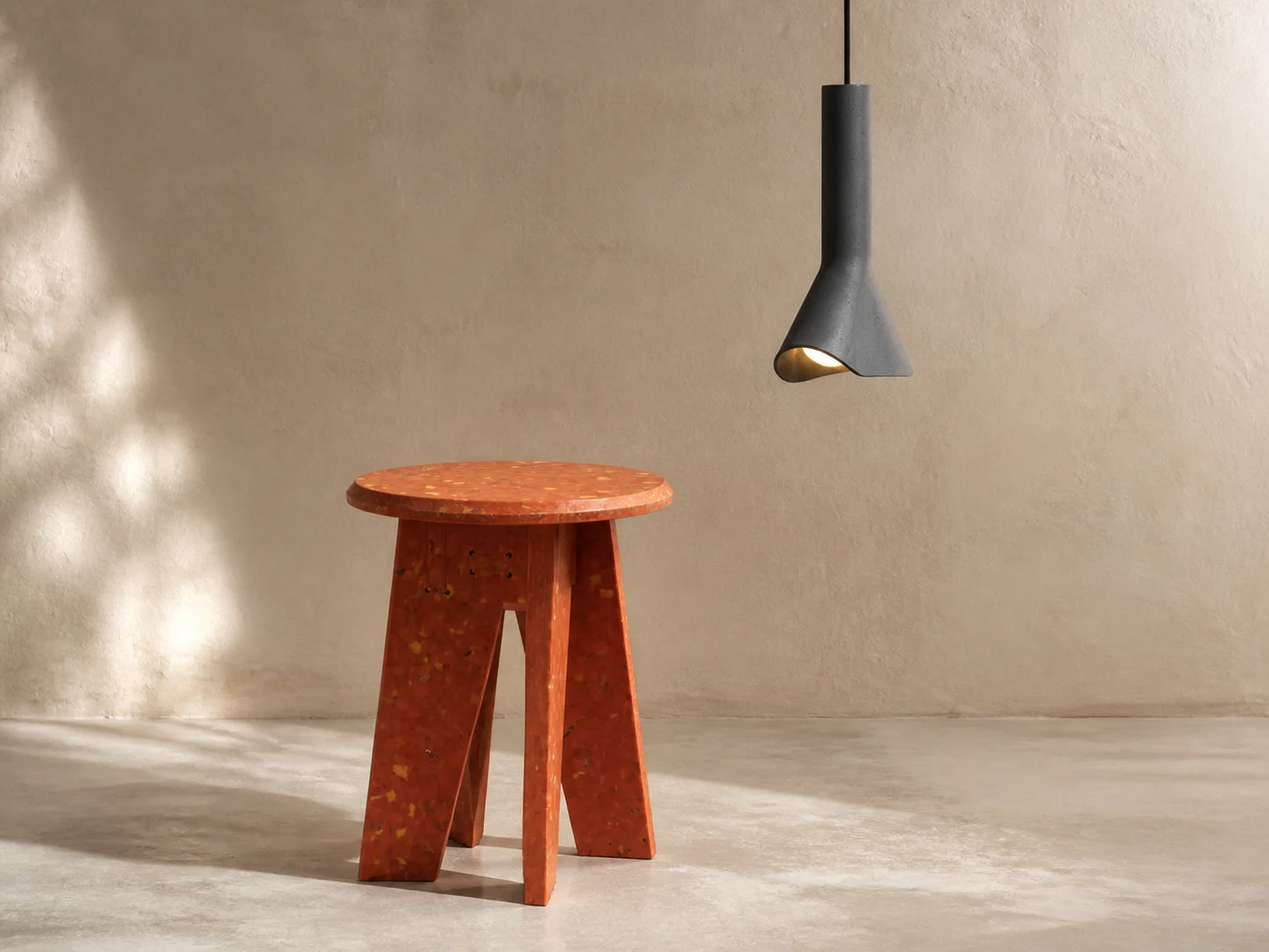
The two objects do not look like a pair. One is a compact piece of furniture in saturated colour, its surface scattered with small flecks. The other is a dark pendant lamp with a narrow concrete body and an off-centre opening. What connects them is not a house style. It is BENTU’s decision to let material history remain visible.
The “#” stool and side table, dated 2024 on BENTU’s official page, begins with municipal plastic waste. The RU Pendant Lamp, dated 2020, combines concrete and aluminium and lists leftover concrete from demolition among its materials. Both turn a waste stream into an everyday object, but they do so with very different visual results.
Colour as evidence
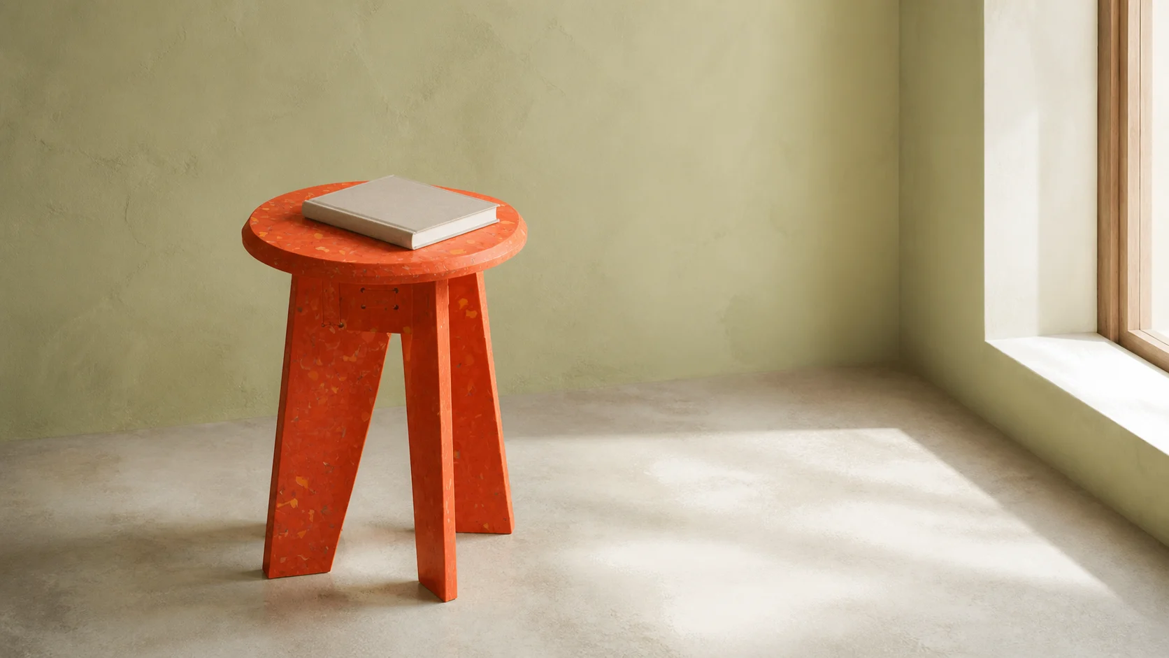
BENTU does not present the “#” object as plastic pretending to be something else. Its official account describes sorting recycled urban plastic by colour, breaking it down and recombining it in controlled proportions. The resulting surface is not visually uniform. Small fragments interrupt the main colour and make the feedstock part of the appearance.
The product is listed at 340mm in diameter, 450mm high and 5kg. Its crossed panel structure supports two uses: upright as a stool or beside a seat as a small table. BENTU also describes the structure as flat-pack, reducing the object to parts for transport and assembly rather than shipping it as a permanent volume.
That decision matters because recycled material is only one part of the object’s story. Form and logistics also affect how it moves through the world. A flat-pack structure can reduce shipping volume, although ChinoMuse has not independently measured the resulting carbon impact. BENTU’s broader sustainability language remains a manufacturer claim; the documented facts are the stated feedstock, dimensions, weight and assembly approach.
A material that refuses perfect sameness
The official presentation shows the “#” object in red, orange, yellow, green and blue. BENTU says leftover production material is also returned to the colour mix and notes that the final surfaces vary. This variability is not a defect hidden by paint. It is part of the product’s identity.
For a mass-produced object, that creates an interesting tension. The diameter, height and structure are repeatable, while the distribution of flecks is not. The object remains recognisable as one design, yet the surface records a batch of recovered material rather than an attempt at perfect visual neutrality.
Concrete, cut open
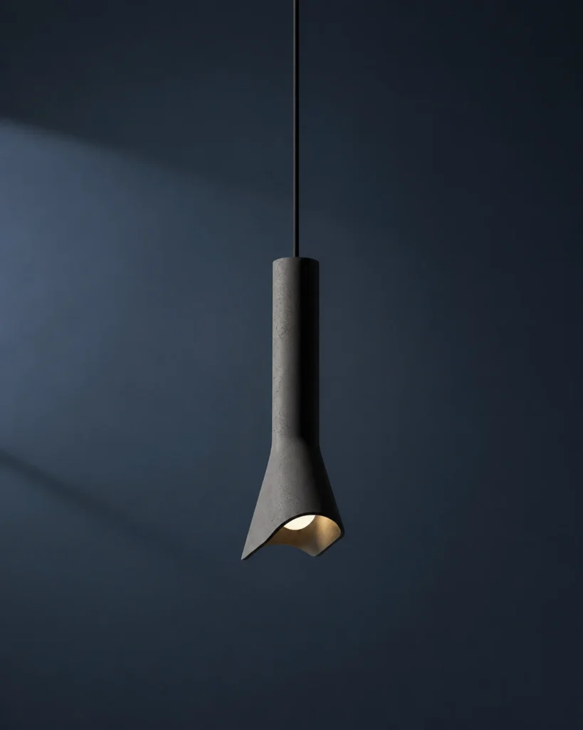
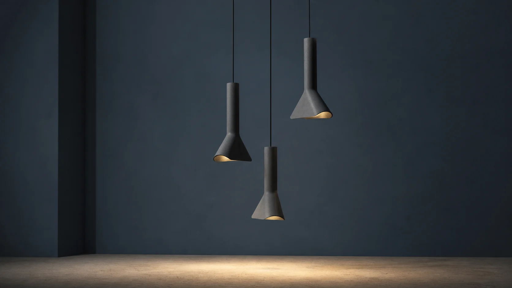
RU takes the opposite route. Instead of colour and visible fragments, it works with a restrained grey body. BENTU lists concrete, aluminium and demolition-leftover concrete, with dimensions of 220 × 75 × 302mm and a weight of 1.2kg. The long body is cut by an asymmetric opening that exposes the light rather than hiding it at the centre of a conventional shade.
The official specification records a black three-metre cord, an E14 LED source, 3W power, 220V and a colour temperature of 2800–3000K. Those values place RU in a specific electrical context. They should not be assumed to apply safely in every market; voltage, fitting, certification and installation need to be checked for the destination.
Concrete is usually associated with mass and permanence. RU compresses that association into a suspended object. The body still looks dense, but the opening removes enough visual weight to make light part of the material composition. The lamp does not disguise concrete as a smooth polymer or polished metal. Small tonal changes and the blunt edge of the opening remain central to how it is read.
Two different meanings of reuse
In “#”, recovered plastic determines colour, texture and construction. In RU, leftover concrete contributes to an object whose appeal comes from the contrast between a rough, heavy-looking material and warm, directed light. One material is made active through recombination; the other through removal.
This difference prevents “sustainable material” from becoming a single visual category. Recycled content does not require every object to look raw, beige or handmade. It can produce bright modular furniture or a dark architectural light. The useful question is whether the material decision can be traced through the object rather than added as a label after the form is complete.
There is also a reason not to romanticise waste. A visible fleck or rough edge may communicate origin, but appearance alone cannot establish responsible sourcing or lower impact. Material recovery becomes credible through records: what entered the process, how it was transformed, how much new material was added and how the finished object can be maintained or recovered again. BENTU’s pages answer some of those questions and leave others open. The gaps are part of an honest reading, not a reason to invent certainty.
What the objects establish—and what they do not
The official records establish product identity and the specifications cited here. They support a close reading of form, stated material and intended function. They do not establish service life, structural performance, electrical compliance outside the listed configuration or a complete environmental assessment.
ChinoMuse has not sat on the “#” stool, assembled it, tested its surface wear or verified the percentage of recycled feedstock in a laboratory. Nor has ChinoMuse installed the RU lamp or measured its light output, heat management or long-term behaviour. These are source-led editorial profiles, not reviews.
Material research at domestic scale
BENTU’s wider site places waste-material recycling and concrete research alongside furniture, lighting, accessories and architectural projects. The “#” object and RU lamp are useful because they bring that position down to domestic scale. They can be understood without a gallery wall or a technical manifesto: one is something to sit on or place a book beside; the other is something that lights a room.
That directness is also why the material choices remain memorable. The waste stream is not the final message. It becomes part of proportion, colour, assembly and light—decisions that determine whether the object works as furniture or lighting in the first place.
Reading BENTU through the objects
A brand profile can describe a material-led practice, but these two products make the idea concrete. “#” turns mixed urban plastic into controlled structure without erasing its fragments. RU gives leftover concrete another role without making the lamp look apologetic or temporary.
Together they show a design position built through objects rather than slogans: waste is treated as a starting condition, then subjected to the same questions as any other material—how it carries weight, how it travels, how it meets the hand and how it shapes a room.